AI Ease Website Redesign
UX/UI Design 2024
Redesigned the AI Ease website, optimizing visual design and user experience to better align with the company’s target audience.
Project Context
Sep 2024 - Dec 2024
Designer: Lingxin Sun
User Interface design
User Experience Design
Graphic Design
Content Design
My Role
Tools
Figma
Photoshop
THE SOLUTION
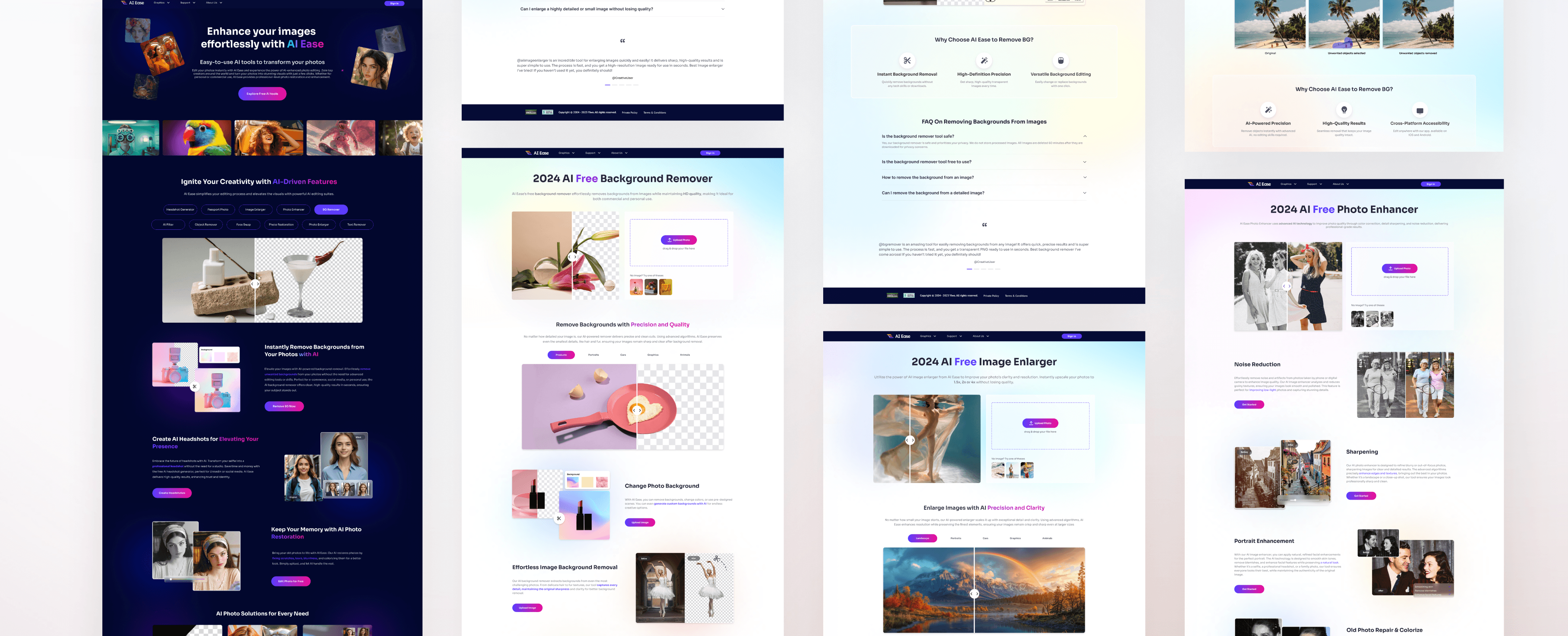
I redesigned AI Ease, creating a cohesive and modern visual system that aligns with the target audience’s preferences, enhances brand trust, and elevates the user experience through consistent design and intuitive workflows.


Before
After
Aligning Design with Trust and Usability
PROBLEM
The original AI Ease website’s outdated and inconsistent design undermines user trust and fails to engage its target audience. Without a cohesive and modern visual system, the platform struggles to convey reliability, limiting its potential as a leader in AI-powered tools.
How can we update AI Ease’s visual system to create a cohesive and appealing design that enhances brand trust and improves users’ access to core values?
CONTRIBUTION
Engaged stakeholders by conducting weekly design reviews to gather feedback and ensure alignment with project goals.
Facilitated collaboration through kick-off meetings and design workshops, fostering a shared vision and streamlined communication among team members.
Established design guidelines, creating a cohesive and scalable system to maintain consistency across the project.
THE IMPACT
95%
95% of users found the modernized visual system more intuitive and appealing, encouraging feature exploration.
85%
85% reported increased confidence in the brand due to the cohesive and professional design.
90%
90% successfully completed editing tasks on their first attempt, showcasing improved usability and workflows.
Based on company-provided data, the redesign of AI Ease resulted in significant improvements in user satisfaction, engagement, and brand trust:
RESEARCH
Understanding user needs and identifying product issues to drive a more intuitive and user-centered design.
UNDERSTAND THE BUSINESS
AI Ease is a new product line under EaseUS, a tech company offering a wide range of data recovery and backup solutions. EaseUS aims to embrace the AI wave by launching AI-driven products. All EaseUS product lines are targeting European and North American market. Image processing was chosen as the entry point for AI Ease, as this field is highly mature in AI technology, enabling AI Ease to leverage advanced and reliable solutions and establish a strong foundation in the competitive AI-powered image editing market.
AI Ease: Redefining Image Editing with Advanced AI
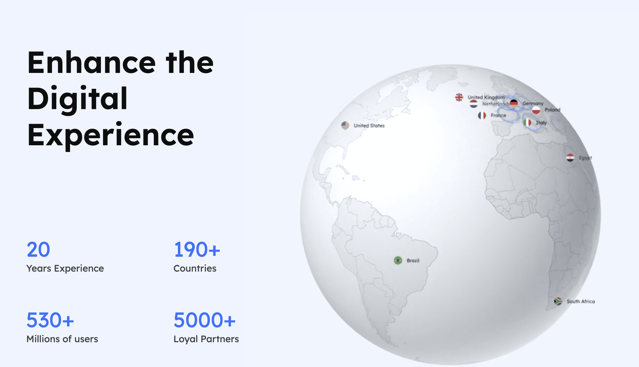
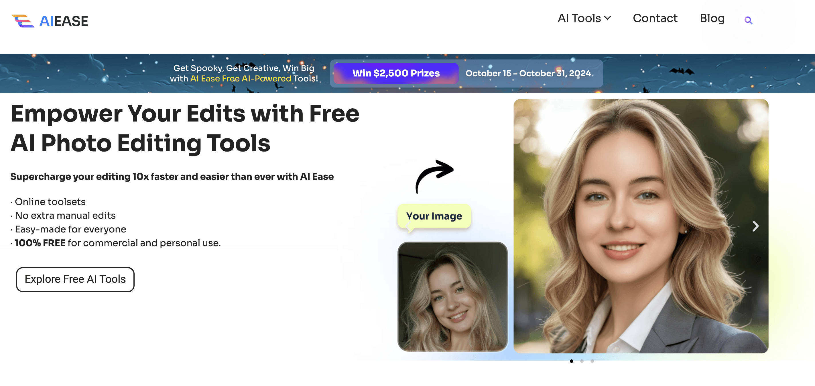

Ease Us Website& AI Ease Website in 2024
USER RESEARCH

Olivia
American, Based in San Francisco
Travel Blogger and Content Creator
• Wants a professional solution for editing photos.
• Needs to ensure her photos are protected from unauthorized use.
• Prefers tools that save time while delivering professional-quality results.
Needs
Frustrations
• Concerned about privacy and data security when uploading personal photos.
• Finds many tools with outdated designs and inconsistent user experiences.
• Struggles to trust websites with unclear policies on photo usage rights.
• Dislikes complex workflows that waste time and hinder her creativity.
Understanding User Needs to Drive Design Improvements
Before I began the design process, the company had already identified the target user group as women aged 20-40, providing a clear direction for subsequent user interviews and needs analysis. I conducted interviews with 15 participants within this age group to explore their challenges and goals when using AI-driven photo editing tools.
Research Findings
To better understand the target audience, I conducted user interviews with women in this age range, aiming to explore their challenges and goals when using image editing tools. The key findings include:
Screen Size Preferences
Users found mobile screens too small for editing and preferred larger computer monitors for better efficiency.
“It’s hard to see the details clearly on my phone. I always switch to my desktop when I need precise editing.”
Efficiency Needs
Overly complex workflows frustrated users, who wanted simpler, more intuitive interfaces.
“I just want to upload my photo and click a few buttons to get the result, but it feels like I’m navigating a maze.”
Privacy Concerns
Users were concerned about privacy risks and unclear policies when uploading personal photos.
“I’m hesitant to upload personal pictures if I’m unsure how they’re stored or if they’re deleted after use.”
Current Product Issues
From the research, we identified the following key problems with the current product:
Inconsistent UX
The interface and workflows lack intuitiveness, making it difficult for users to complete tasks efficiently.
“I have to click through so many steps to find what I need. It feels all over the place.”
Outdated Visual Design
The design is outdated and fails to attract the target audience.
“The website looks old-fashioned and doesn’t make me feel confident about the tools.”
Lack of Trust
The design lacks a cohesive standard, and makes it hard for users to trust the products.
“If the website doesn’t look professional, how can I trust their AI tools?”
DESIGN
Enhancing usability through refined visuals, user alignment, and a cohesive design system.
USER FEEDBACK AND REFINEMENT
After
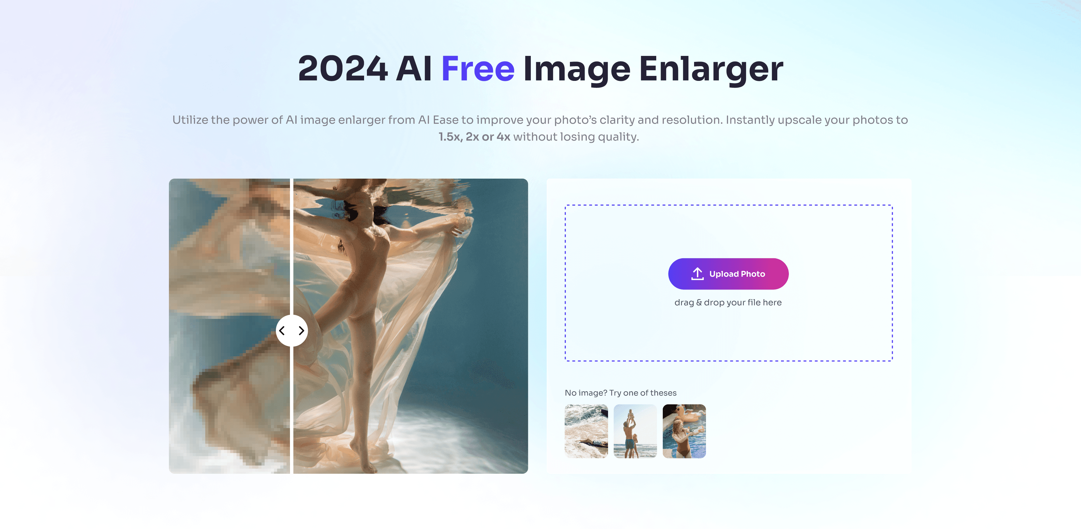
Streamlining User Flows with Direct Upload
Before
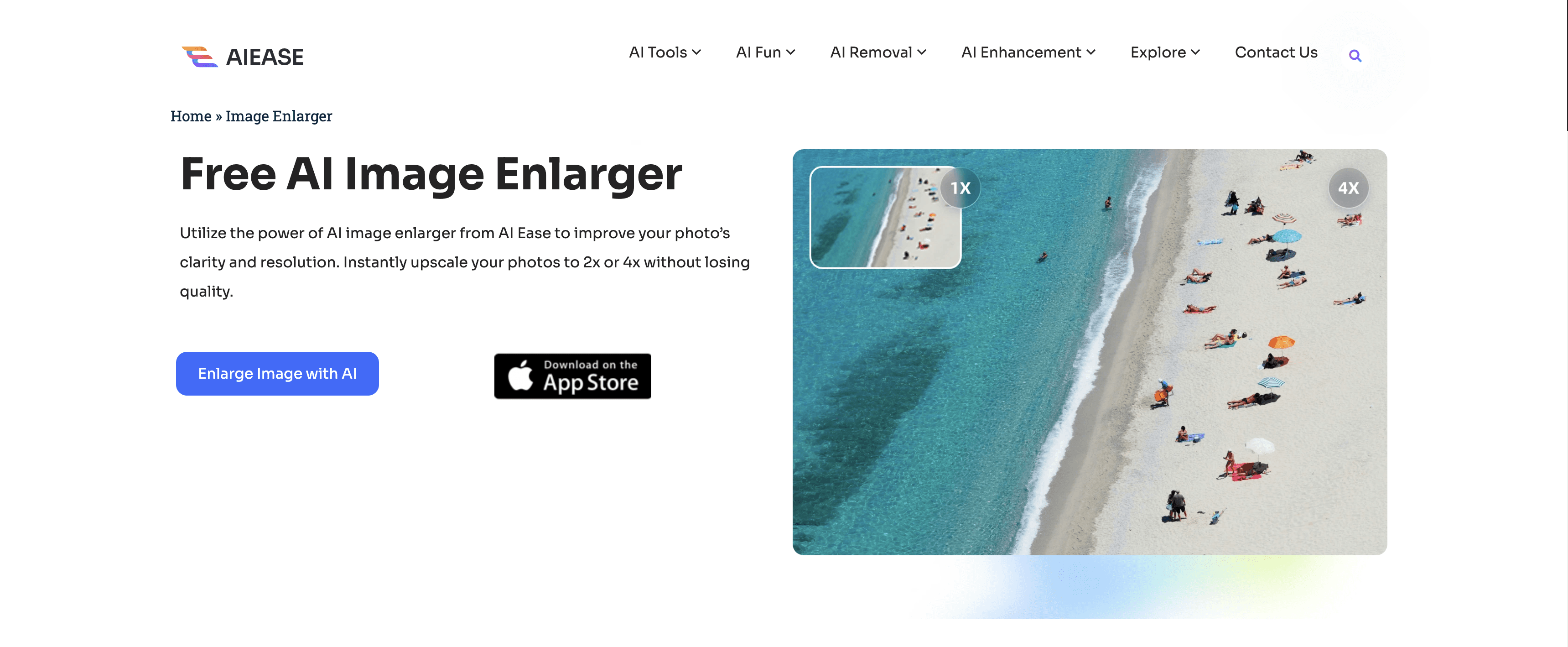
Added a direct upload entry point on the banner to simplify the user flow.
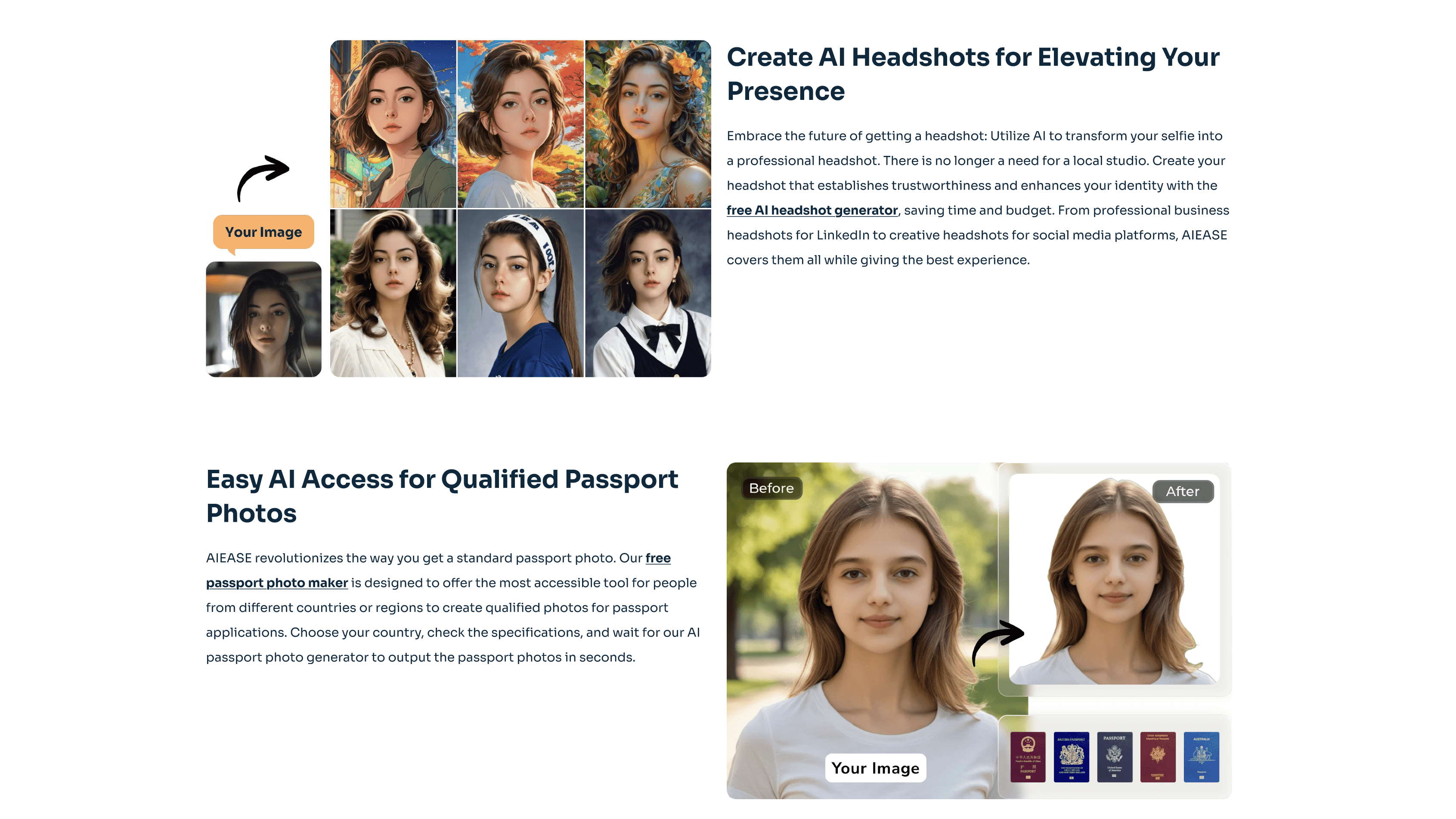
Improving Accessibility and Readability
Before

After
Emphasized keywords for better readability.
Added direct entry points for quick tool access.
IMAGE
The Foundation of Visual Redesign
Due to budget constraints, I carefully selected photography from the Freepik platform that aligns with the website’s style and resonates with the preferences of our target audience. These images played a crucial role in the website redesign process and will serve as a mood board, providing inspiration for future page updates and guiding the creation of similar visuals. These photos reflect a modern, professional aesthetic that is highly consistent with the brand’s tone, laying a solid foundation for the website’s visual enhancement.

VISUAL LIBRARY
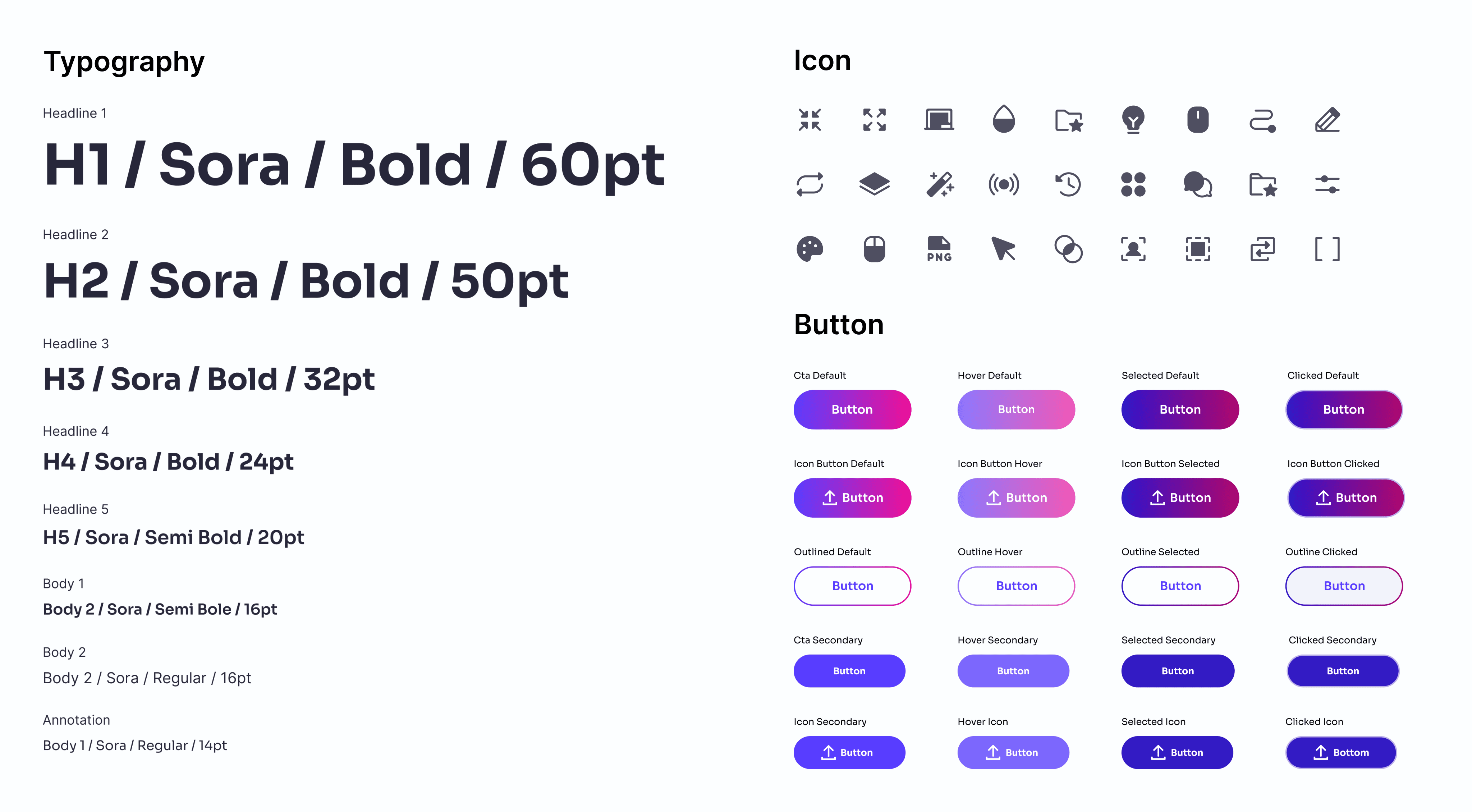
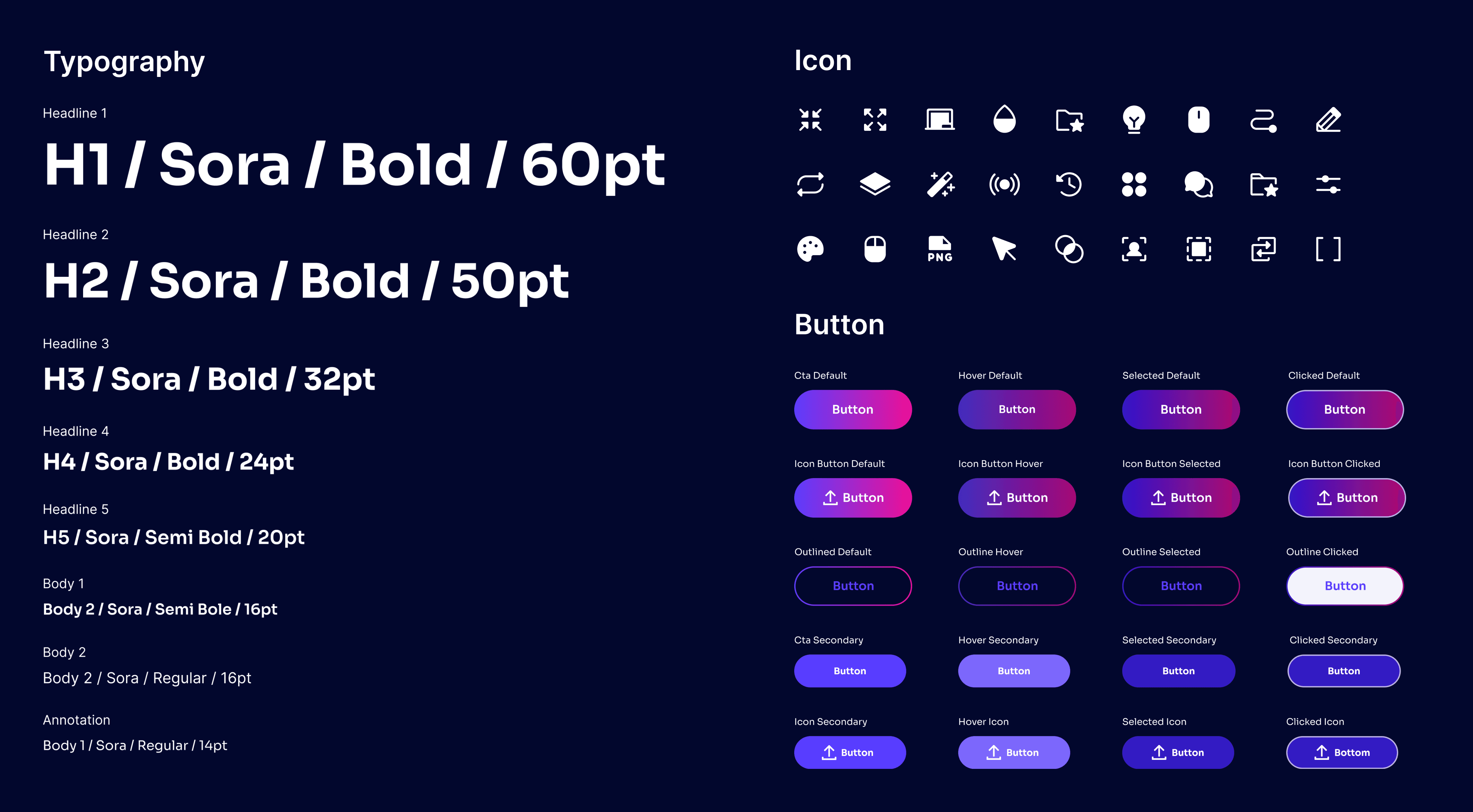
Design System Explanation
To ensure design consistency, I collaborated with the manager to define guidelines for button radii, widths, and typography. Block-style icons were chosen to enhance visual appeal and maintain a cohesive aesthetic across the platform.
COLOR
A Color System Inspired by User Preferences
To better attract the target audience, I analyzed user preferences and found that women generally prefer vibrant and fresh color schemes. Therefore, I selected a vivid purple as the primary color, complemented by pink and light blue as secondary accents. By blending warm and cool tones with gradient overlays, the design achieves a fresh, soft, and visually appealing experience.
Neutral Colors/Gray Scale Colors
Title
#27273A
Border
#474753
Background
#EDEDF4
Primary Colors
#583DFF
Secondary Colors
#8BEEFF
Accent Colors
#5C3CFD #EE0F96
Primary/Secondary/Accent Colors
FINAL WORK
Homepage


Other page


LEARNING
Enhancing usability through refined visuals, user alignment, and a cohesive design system.
REFLECTION
In this project, I successfully completed my first internship project under the guidance of the lead designer. Unlike previous experiences, I learned how to balance my creativity with company requirements, ensuring the design met business goals while remaining innovative. Additionally, as this project involved designing an entire series of interfaces, I gained valuable experience in coordinating color choices across different screens to create a cohesive visual style, ensuring they look unified and belong to the same product line. This process significantly improved my collaboration skills, adaptability, and ability to think systematically about design.
Balancing creativity and consistency in a cohesive design system.
