
Identity System Redesign For Numi Tea
Graphic Design 2024
Redesigned the Muni Tea brand, focusing on visual identity and user experience to better connect with tea enthusiasts and align with modern design trends.
Project Context
March 2024 - September 2024
Designer: Lingxin Sun
Graphic Design
Art Direction
My Role
Tools
Photoshop
Adobe Illustrator
PROBLEM
The existing Muni Tea brand lacks a consistent and contemporary design, limiting its ability to connect with its target audience. Without a clear and visually appealing identity, the brand struggles to convey its commitment to quality and tradition, missing opportunities to engage and inspire customers.
How can we redefine Muni Tea’s brand identity to create a cohesive and visually engaging design that attracts modern tea enthusiasts and communicates the brand’s core values?
THE SOLUTION
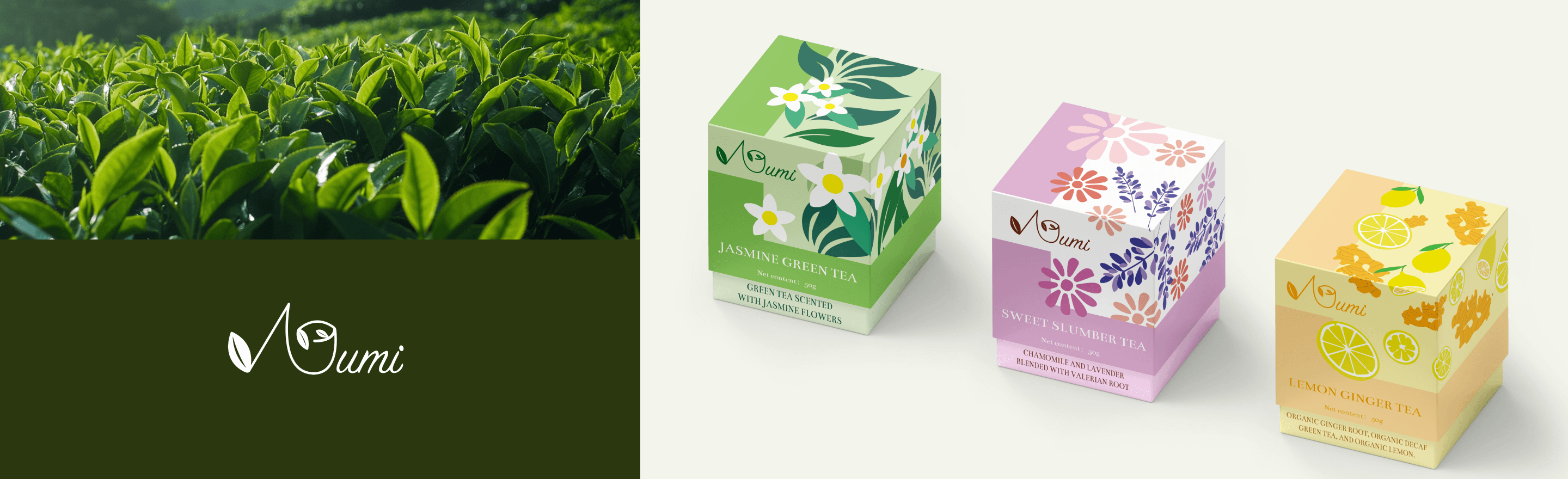
I redesigned the Muni Tea brand identity by incorporating flat-style illustrations and adjusting the color palette, creating a cohesive and modern visual system that aligns with the preferences of today’s market users and enhances brand trust.
Enhancing Brand Appeal Through Visual Unity and User Experience Optimization
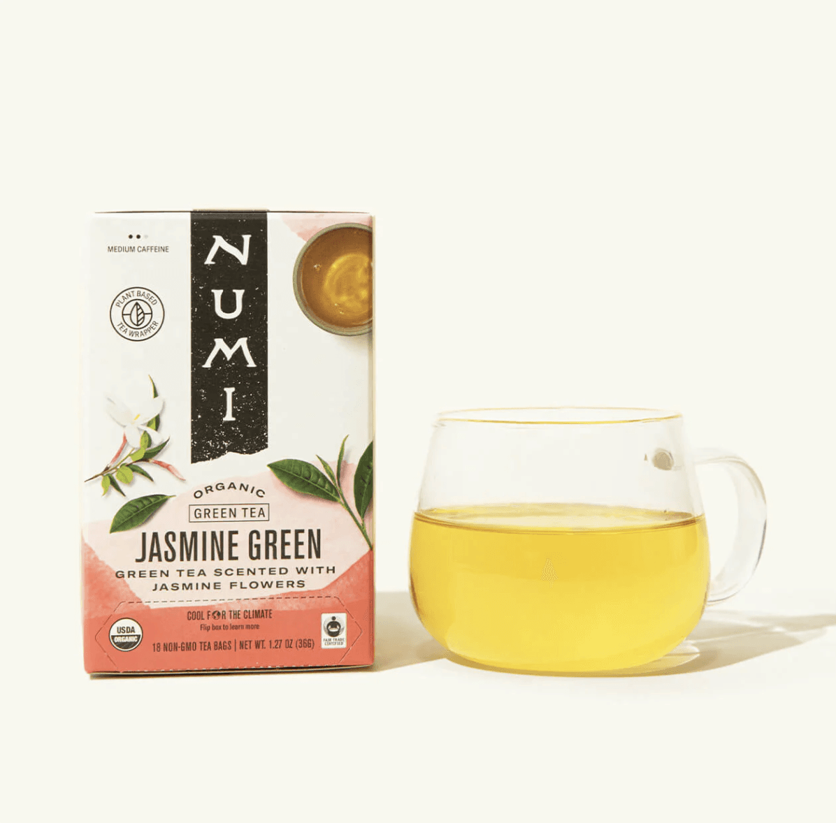
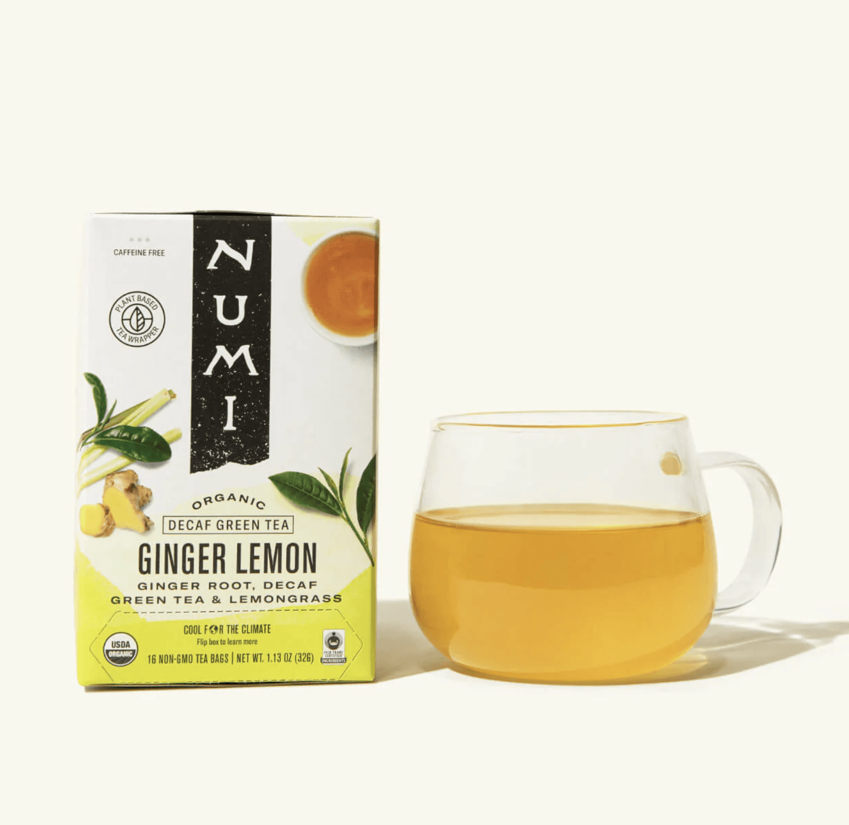
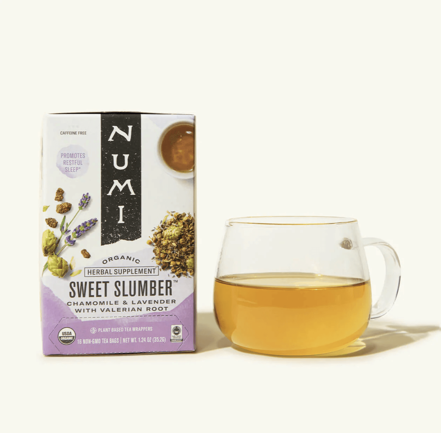
Before
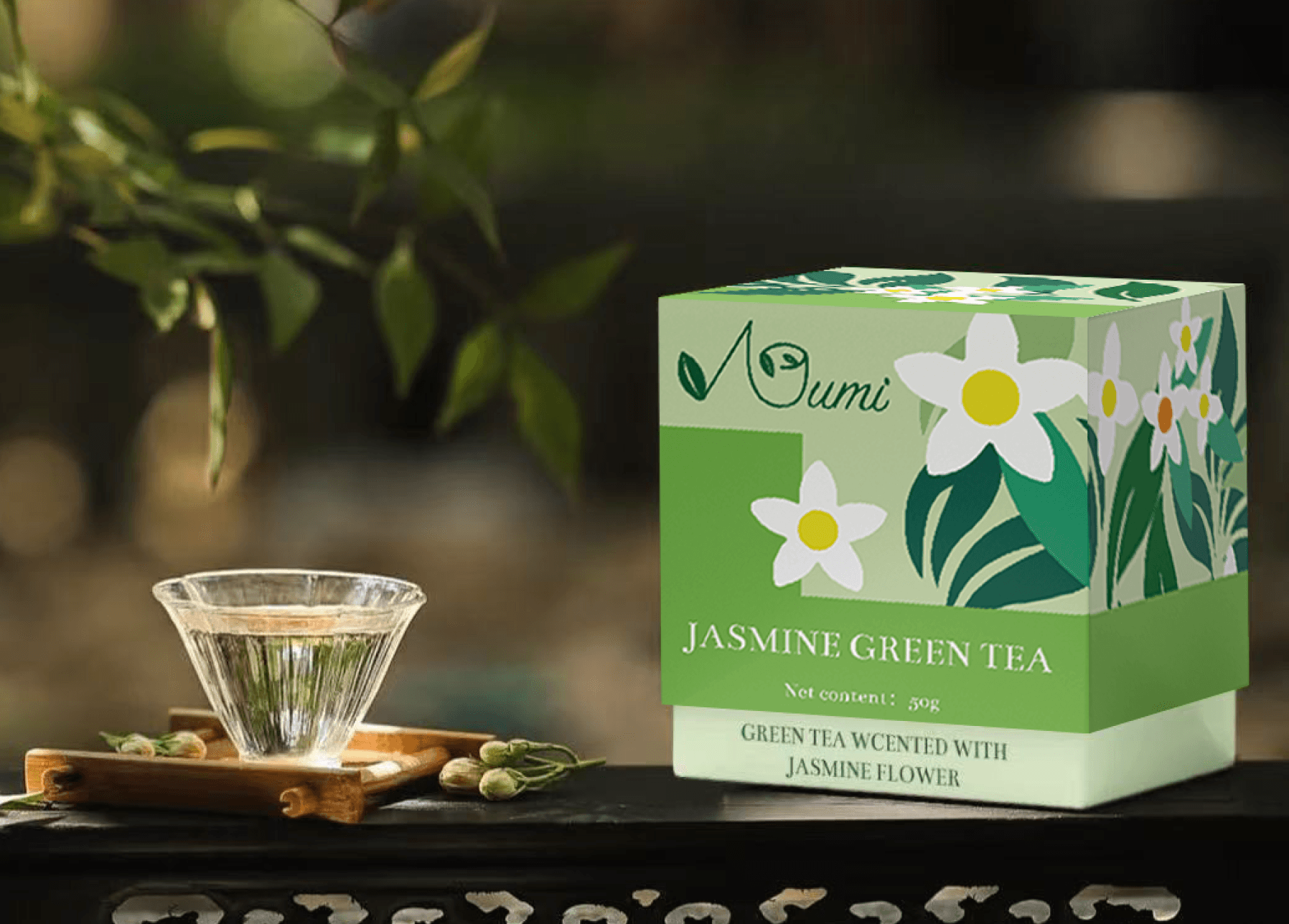
After
THE IMPACT
95%
95% of participants found the flat-style illustrations and updated colors more appealing, enhancing brand perception.
90%
90% said the new design effectively conveyed the brand’s values of tradition and quality.
85%
85% noted the new identity better attracts younger consumers and improves market recognition.
The redesign of AI Ease resulted in significant improvements in user satisfaction, engagement, and brand trust:
RESEARCH
Understanding user needs and solving key issues to create a brand that balances tradition and modern aesthetics.
UNDERSTAND THE BUSINESS
Muni Tea is a conceptual tea brand that reimagines traditional tea culture for a contemporary audience. By combining the rich heritage of tea with modern design elements, Muni Tea seeks to create a unique brand identity that resonates with tea enthusiasts of all ages.
Muni Tea: Blending Tradition with Modern Aesthetics
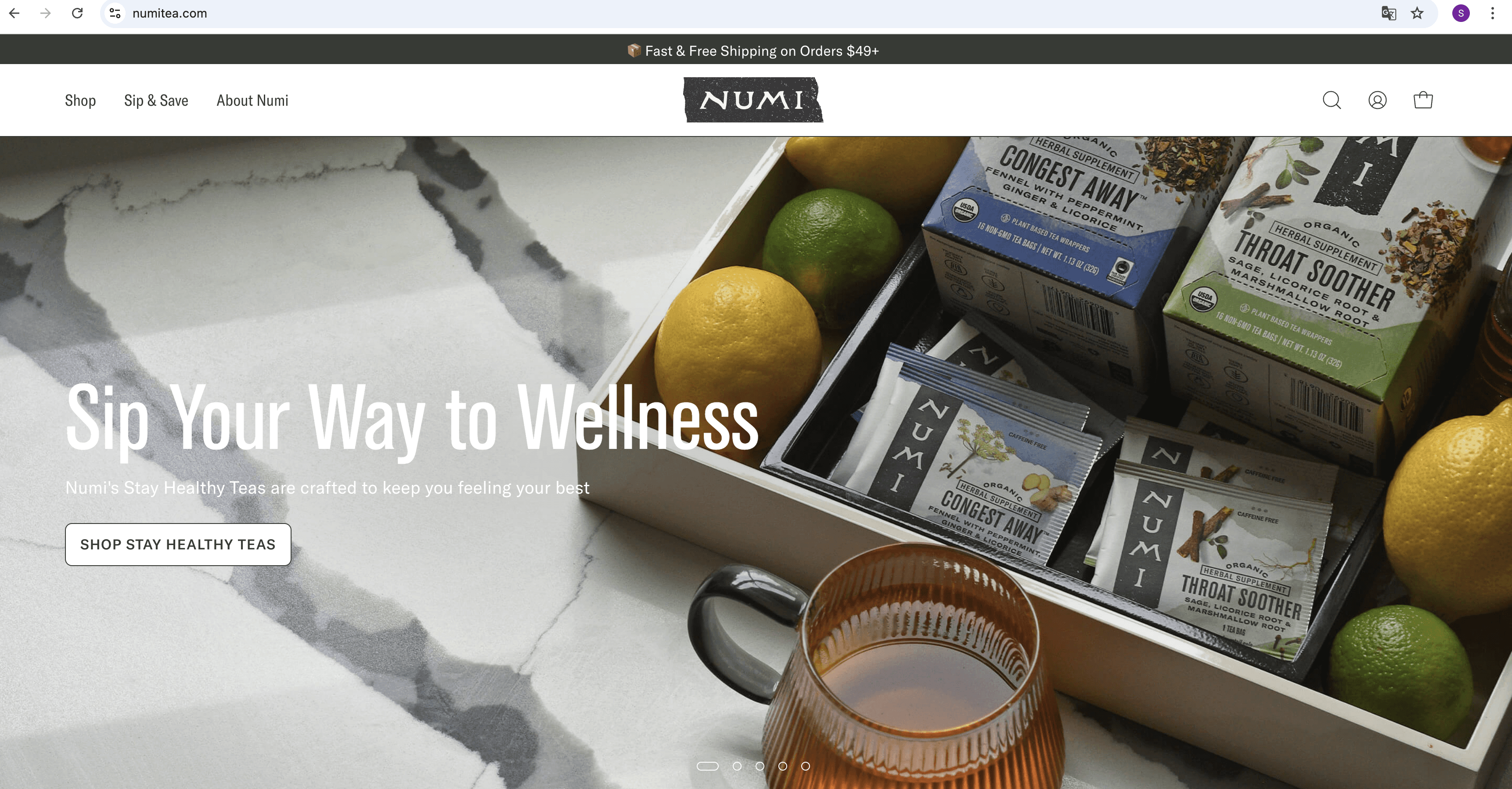
Numi Tea Website in 2024
USER RESEARCH

Emily
American, Based in New York
Tea Enthusiast and Lifestyle Blogger
Seeks a brand that blends traditional tea culture with modern, aesthetic design.
Wants a product that offers a sense of quality and ritual, suitable for both daily use and social media sharing.
Prefers convenient purchasing options and a variety of flavors to explore.
Needs
Frustrations
Finds many tea brands outdated in design, making them less appealing to younger consumers.
Lacks trust in brands that fail to communicate strong values and product quality.
Thinks most tea packaging lacks creativity and struggles to stand out in the market.
Understanding User Needs to Drive Design Improvements
Before starting the design process, I analyzed the target audience for the tea market, identifying urban professionals and tea enthusiasts aged 25-50 as the primary user group. This research laid the foundation for subsequent user interviews and needs analysis.
Research Findings
To better understand the target audience, I conducted user interviews with tea enthusiasts aged 25-50, exploring their expectations and challenges when engaging with tea brands. The key findings include:
Aesthetic Expectations
Users preferred modern designs that balance tradition and minimalism.
“Most tea packaging designs feel outdated; I hope for something modern that still reflects tradition.”
Packaging Needs
Users wanted beautiful packaging suitable for sharing on social media.
“I’d love packaging that’s so beautiful it’s Instagram-worthy.”
Emotional Connection
Users valued brands that create a sense of ritual and relaxation.
“I want a tea brand that makes me feel relaxed and connected to its story.”
Current Product Issues
From the research, I identified the following key problems with the current tea market and branding:
Lack of Unique Packaging
The interface and workflows lack intuitiveness, making it difficult for users to complete tasks efficiently.
“Most tea packaging looks similar; nothing really grabs my attention.”
Disconnected Identity
The design is outdated and fails to attract the target audience.
I can’t understand the brand’s values from the current packaging.”
Missed Media Potential
The design lacks a cohesive standard, and makes it hard for users to trust the products.
“The current packaging doesn’t make me want to take pictures and share them on social media.”
RESEARCH
Redefined the brand identity of Numi Tea.
LOGO DESIGN
Why Redesign the Logo?
The original Numi Tea logo lacked the visual appeal and symbolic depth needed to resonate with modern consumers. As the tea market evolves, it’s essential for the brand to reflect both its traditional roots and appeal to a younger, design-conscious audience. The redesign was intended to create a more engaging and meaningful identity by incorporating tea-related elements, enhancing brand recognition, and making the logo versatile across different platforms.
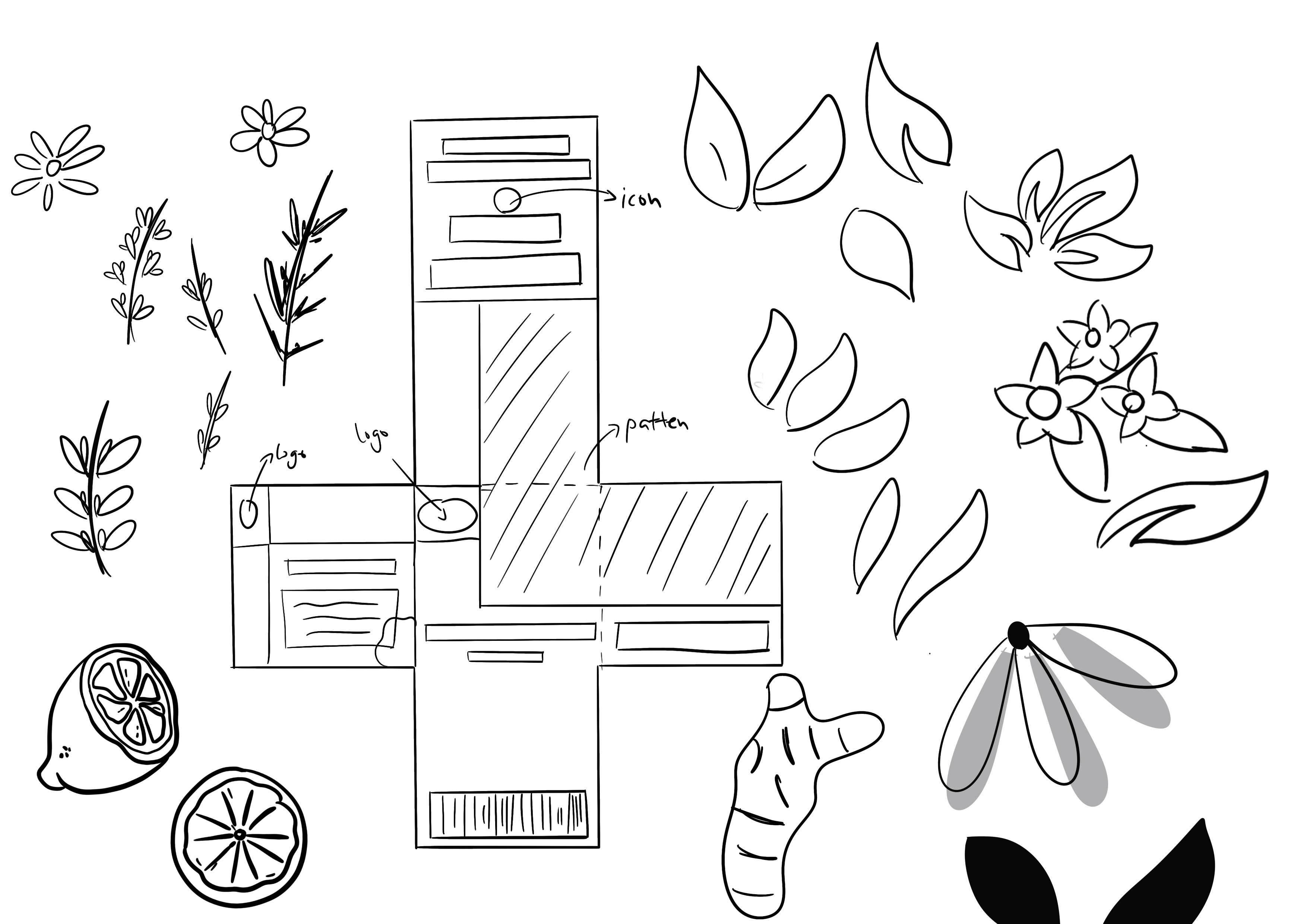
Design Process: Exploration and Innovation
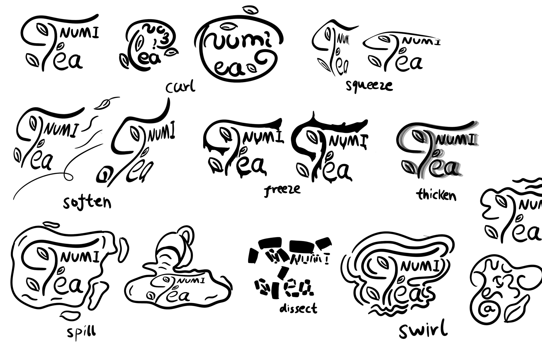
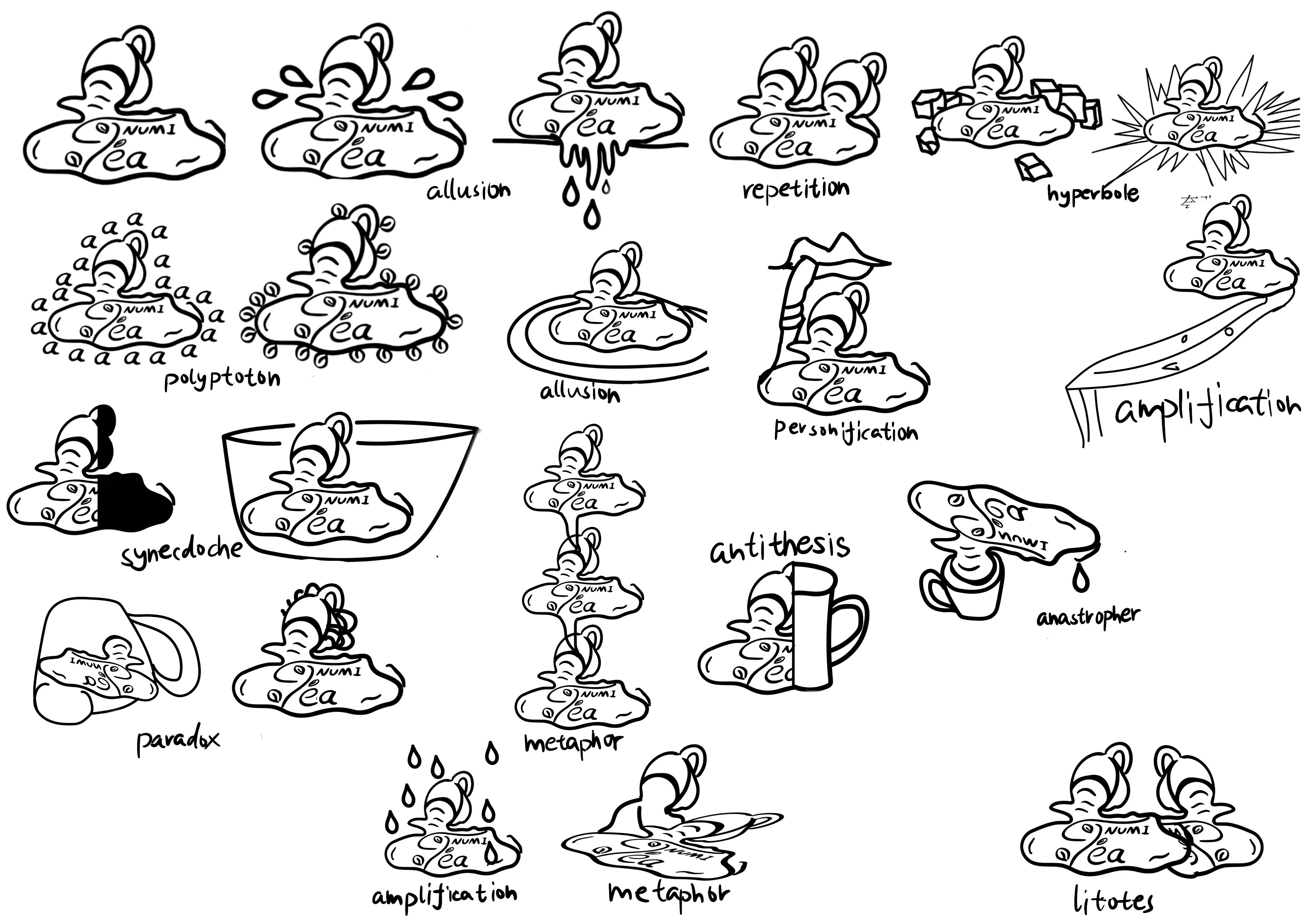
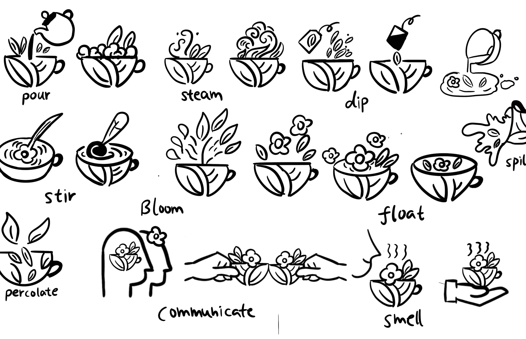
To create the most fitting logo, I sketched hundreds of icons and carefully selected the design that best represented the brand’s identity. Additionally, I incorporated literary rhetorical techniques, such as personification, metaphor, and parallelism, into the logo design to add depth and cultural significance. I also integrated verbs related to tea, such as “brewing,” “drinking,” “growing,” and “melting,” into the design process. These diverse actions enriched my imagination and infused the final logo with dynamism and vitality.
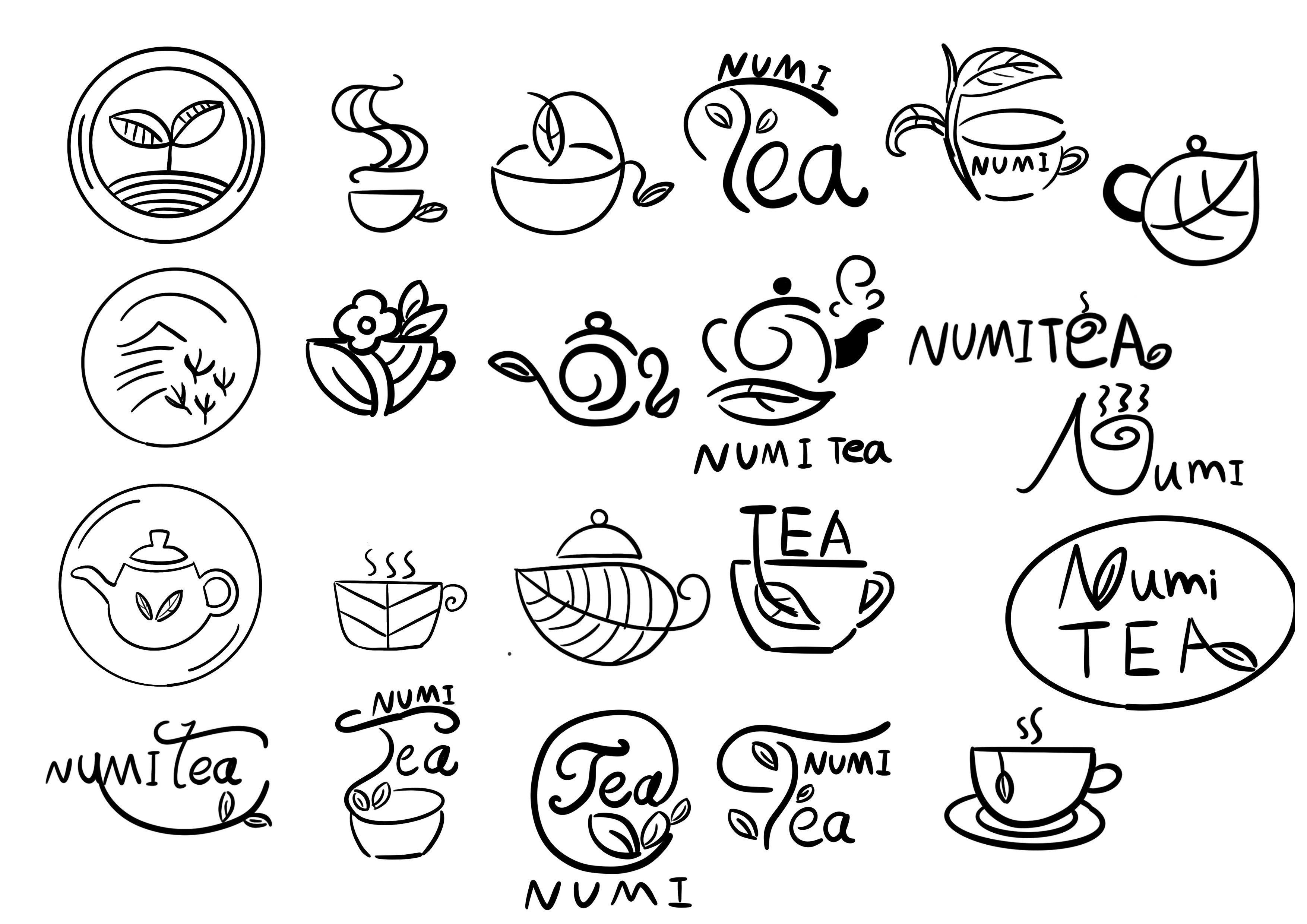
Final Logo Redesign: A Modern Interpretation of Tea Culture
The redesigned logo for Numi Tea incorporates tea leaf elements into the typography, symbolizing the essence of tea culture. I used flowing lines to create the design, shaping the “N” to resemble the growth of a leaf, evoking the imagery of a vibrant tea forest. The remaining letters were also designed with smooth, soft lines, conveying a sense of relaxation and comfort. This approach aligns the logo with the calming and natural qualities of tea culture.
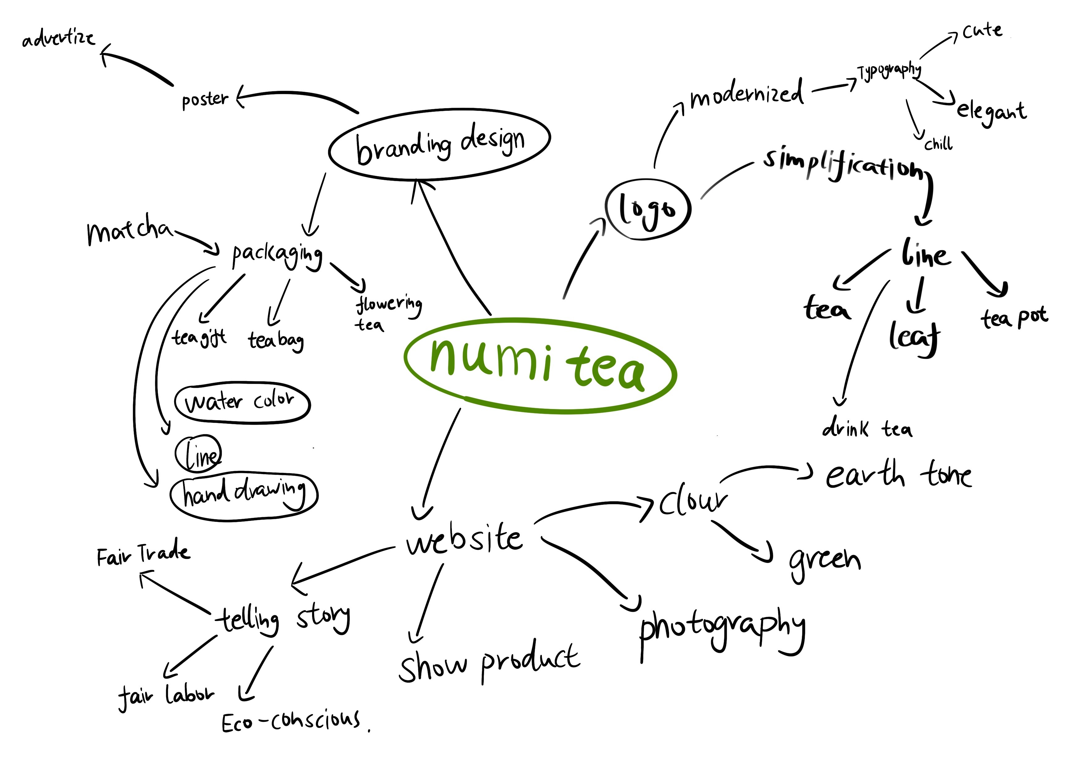
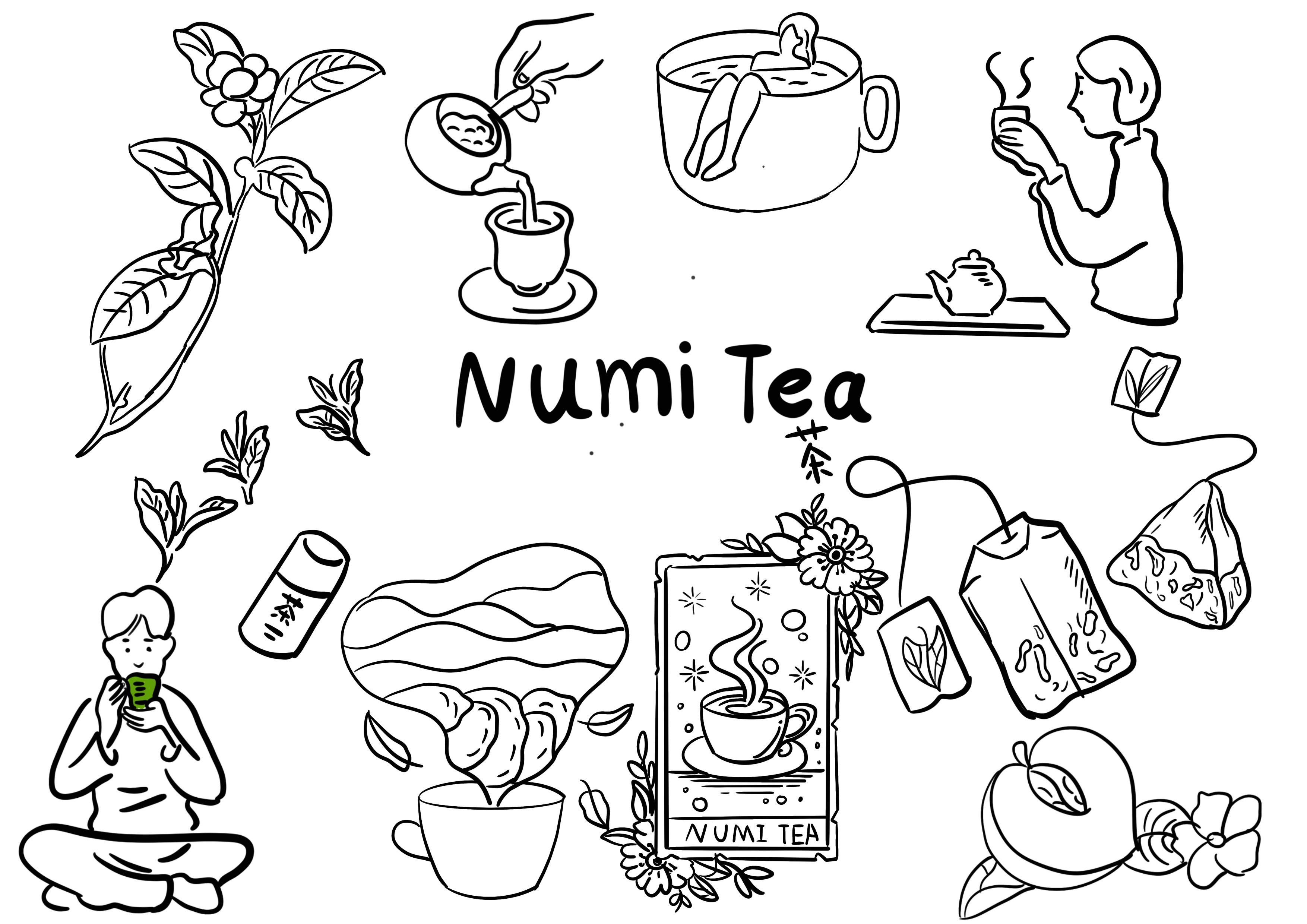
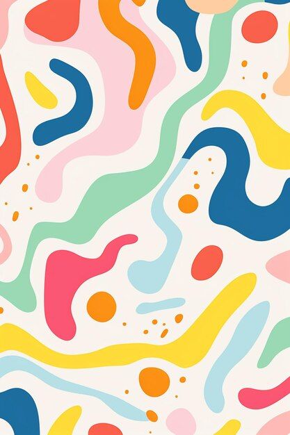
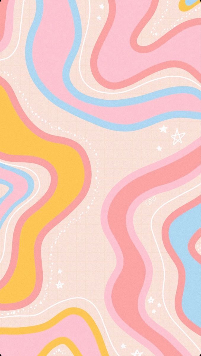
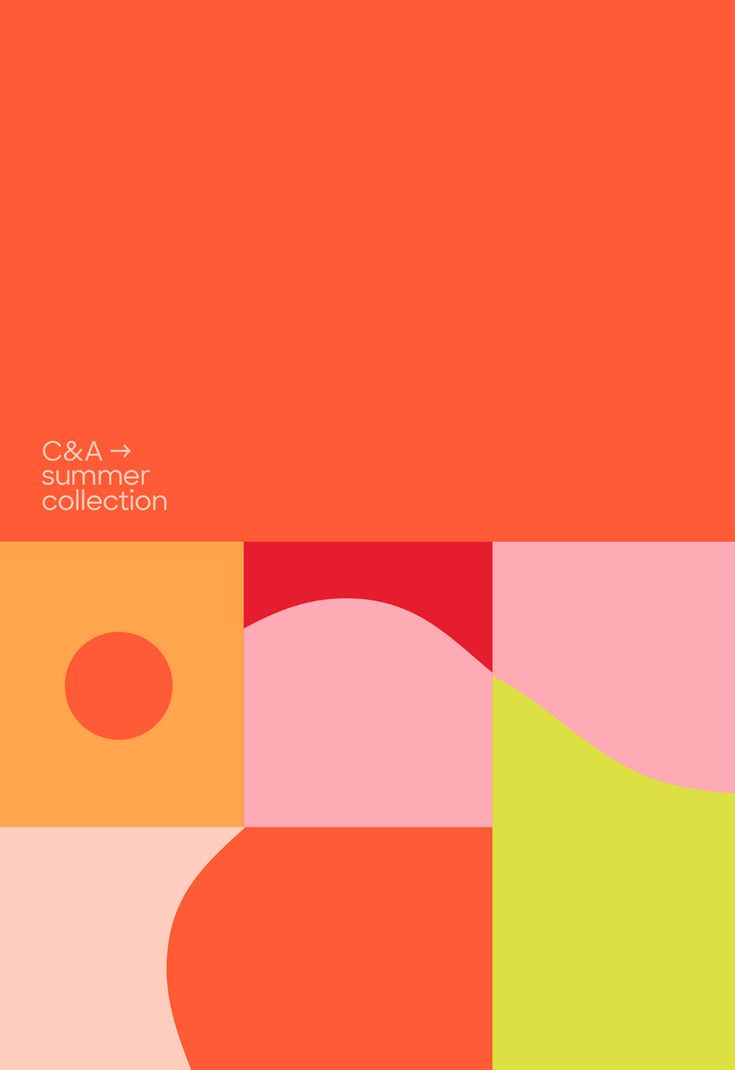
MOOD BOARD
Crafting Bold and Unique Designs for Numi Tea
To help Numi Tea stand out in competitive markets, I aimed to create a design that is bold, unique, and innovative. I want the packaging to evoke an immediate desire to purchase upon seeing it. For this reason, I selected these images to form my mood board.
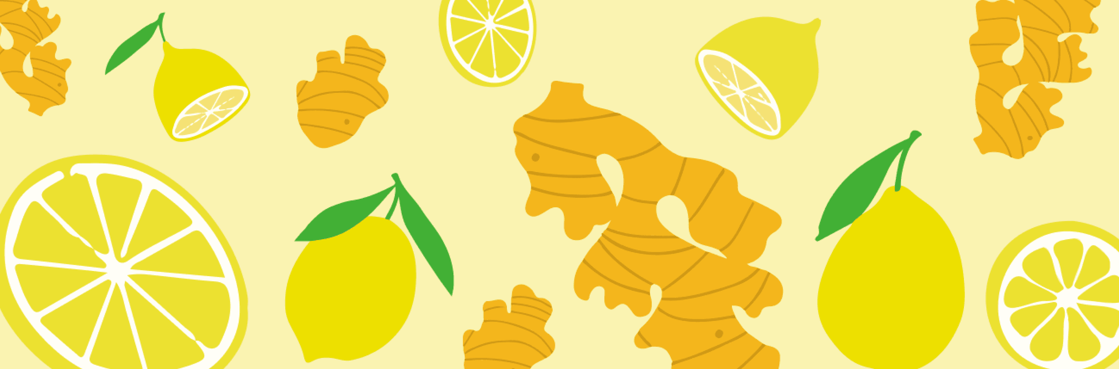
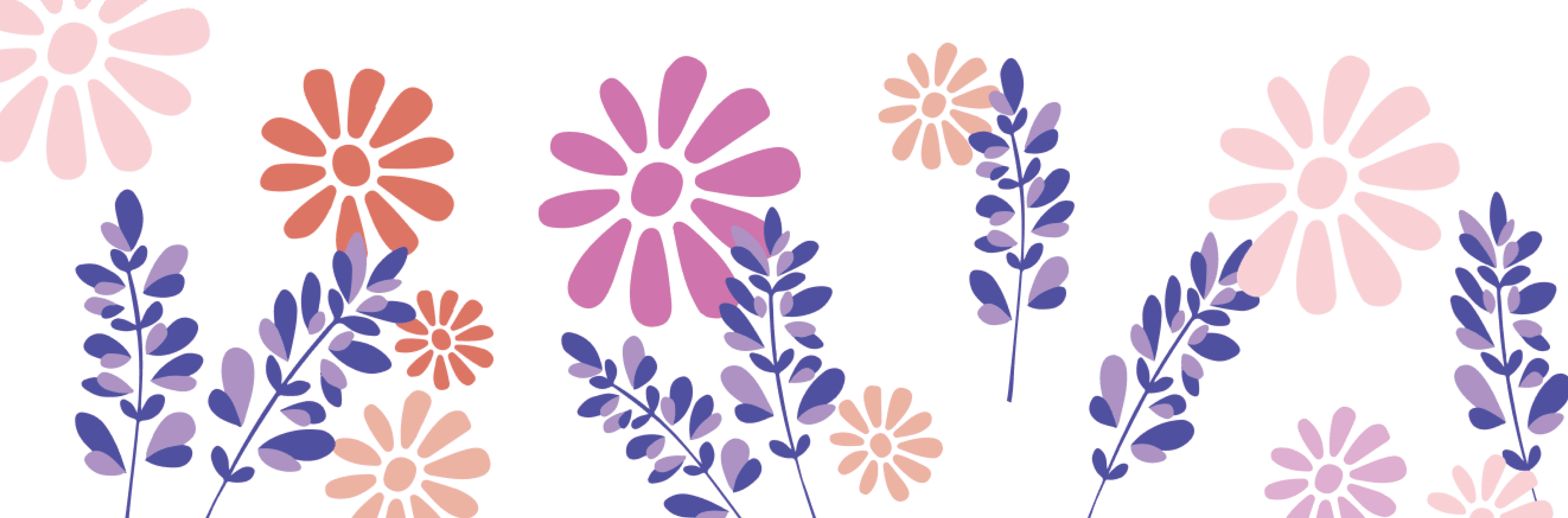
PATTEN DESIGN
Crafting Bold and Unique Designs for Numi Tea
To help Numi Tea stand out in competitive markets, I aimed to create a design that is bold, unique, and innovative. I want the packaging to evoke an immediate desire to purchase upon seeing it. For this reason, I selected these images to form my mood board.

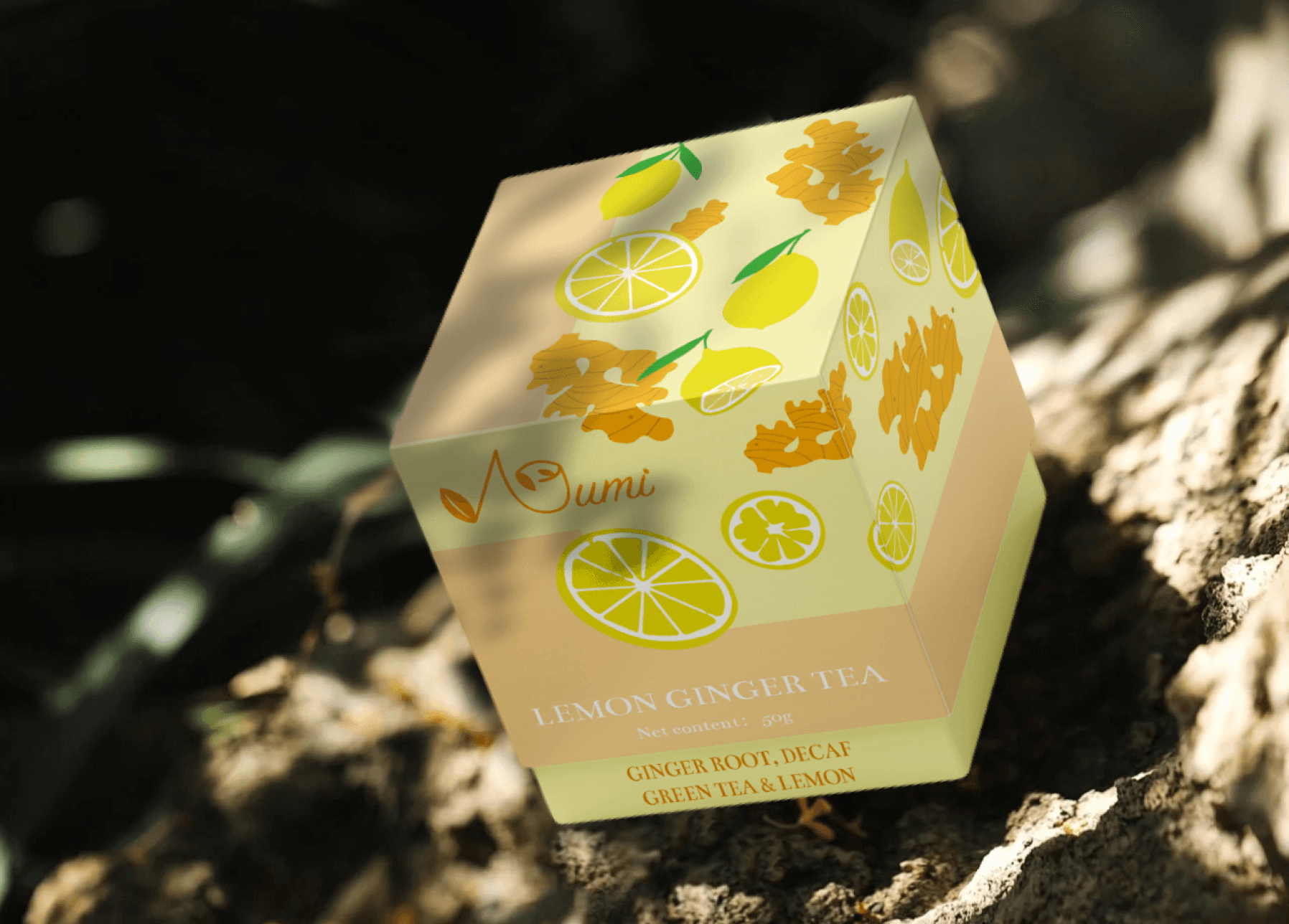
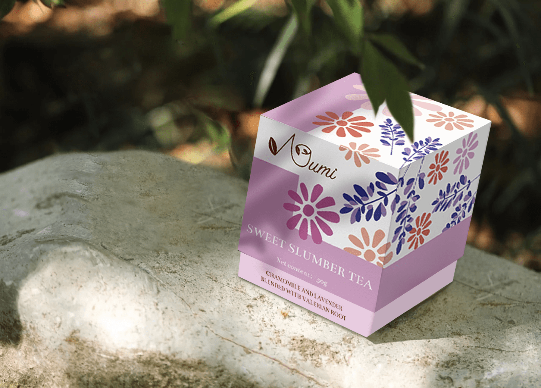
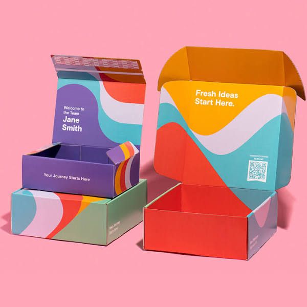
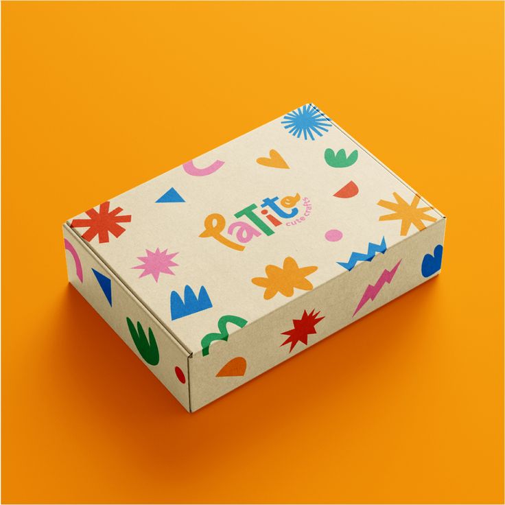
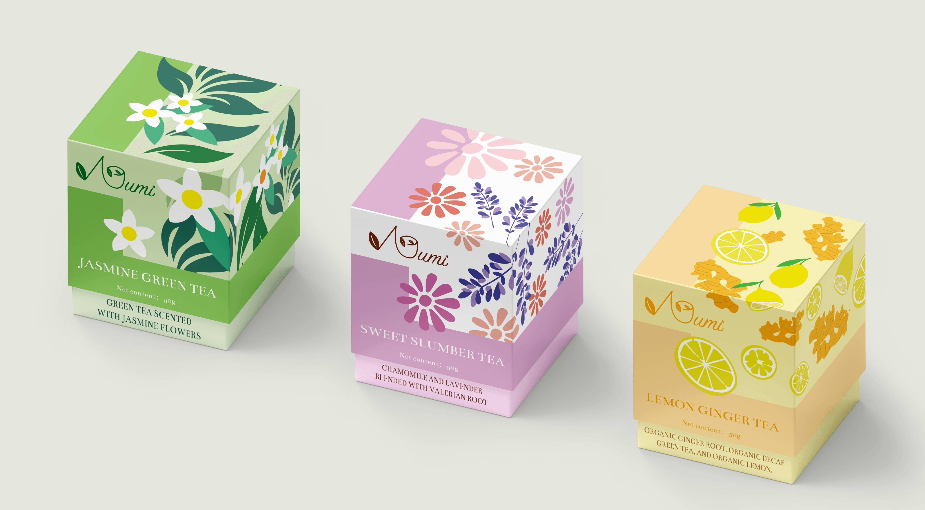
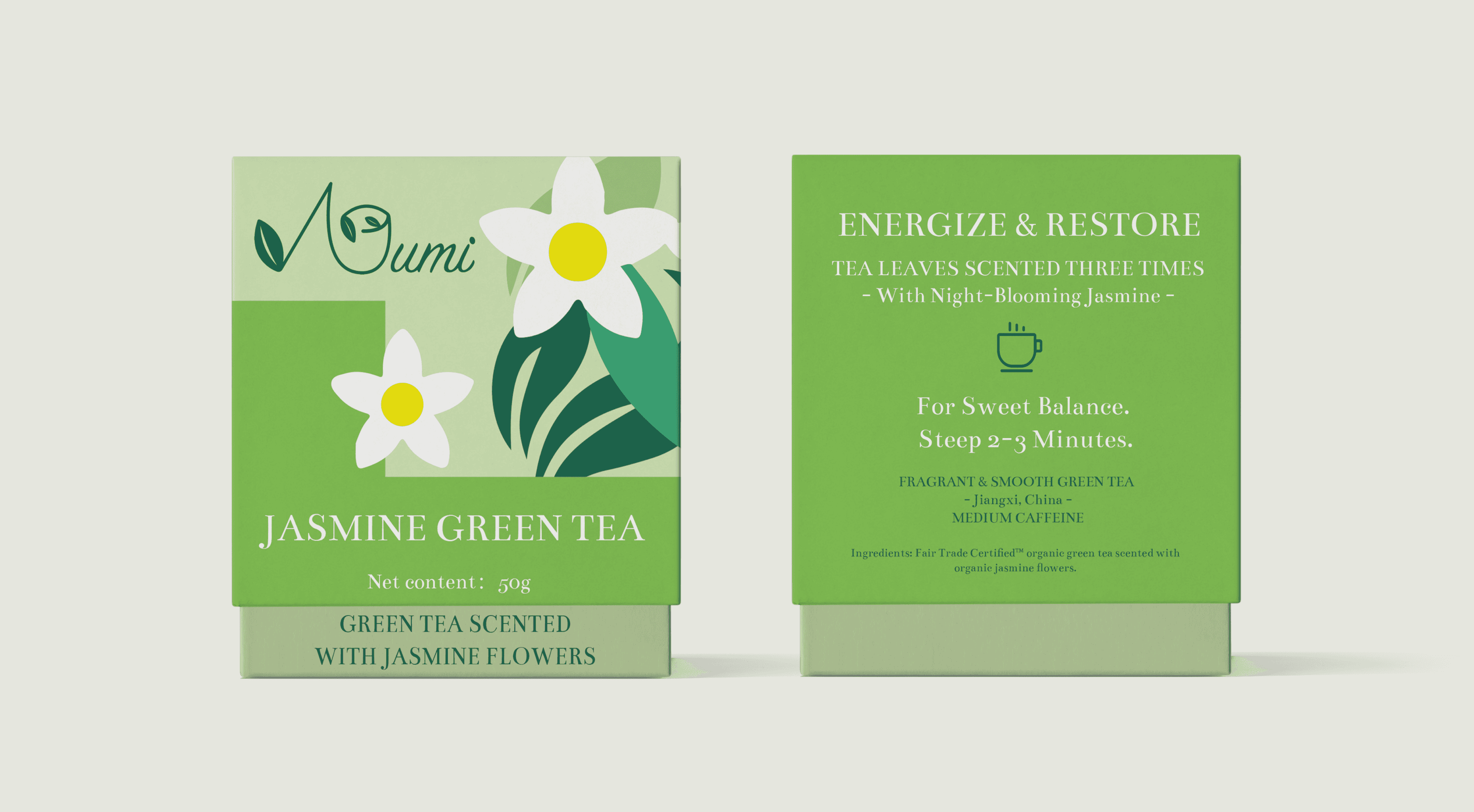
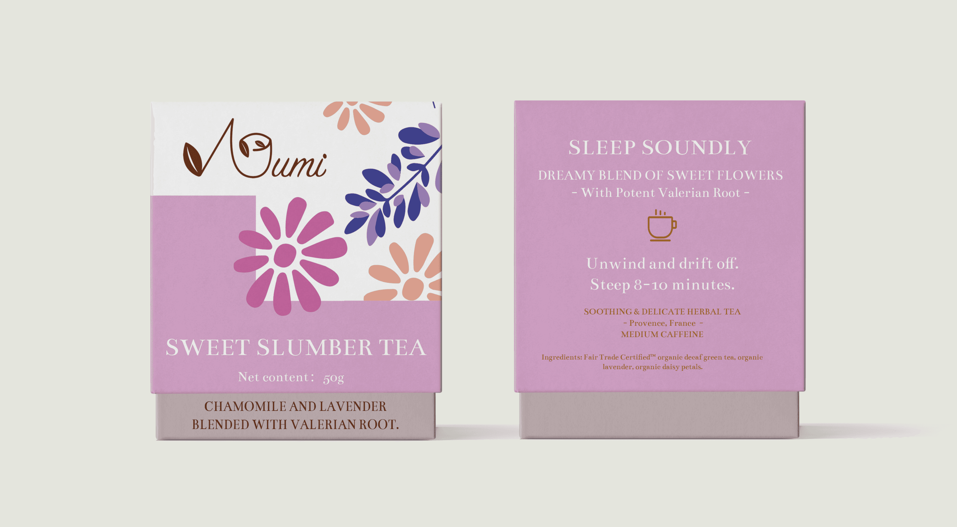
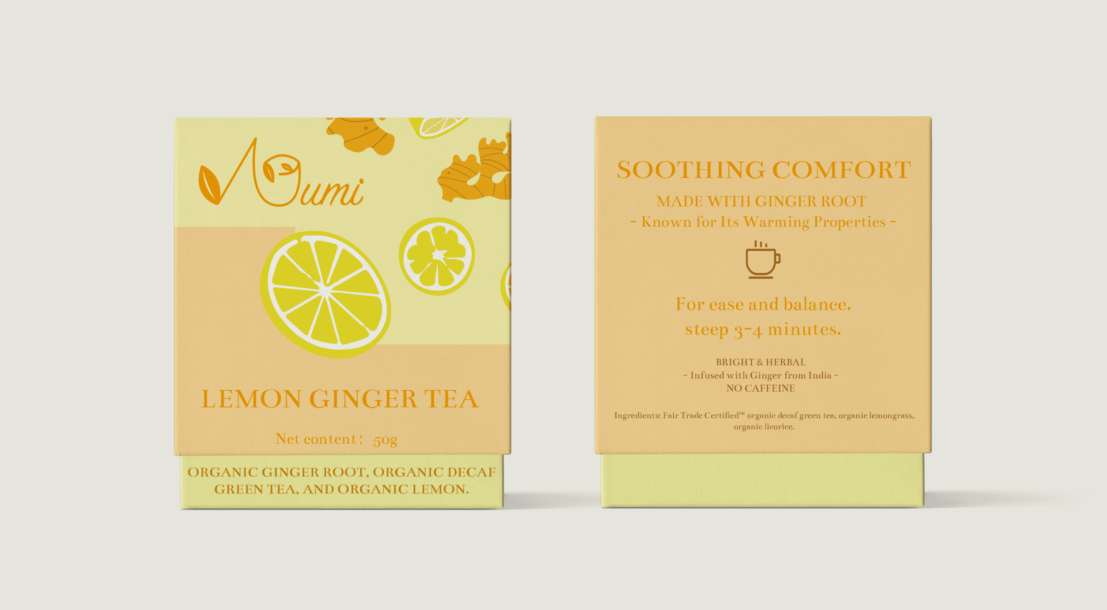
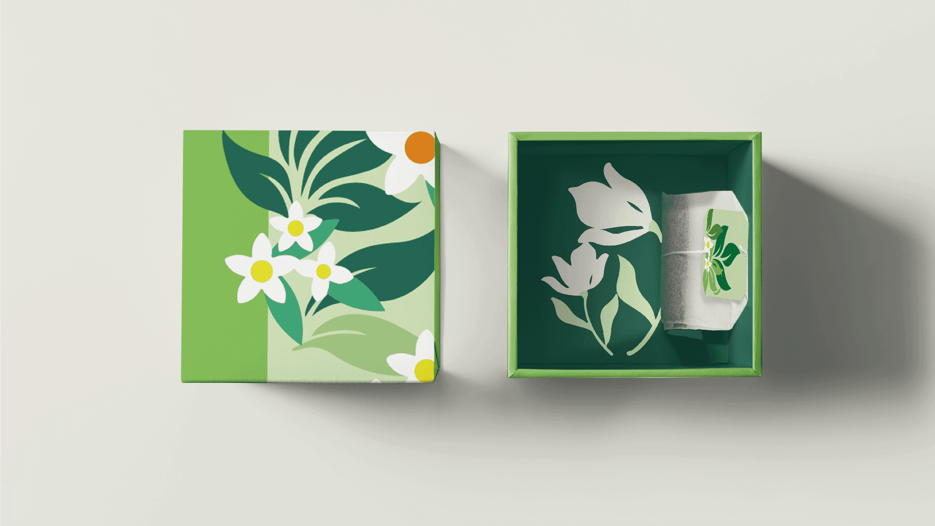
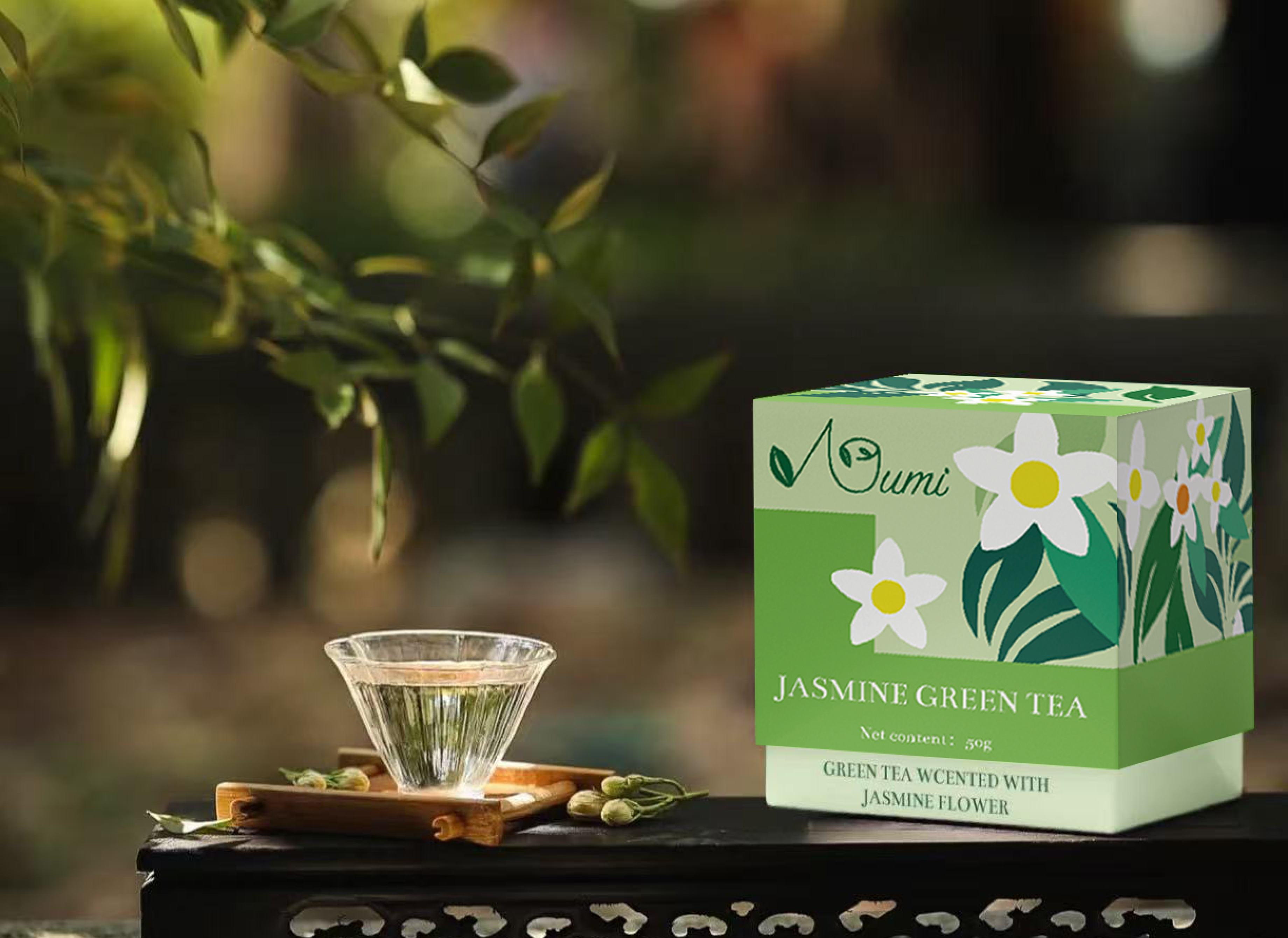
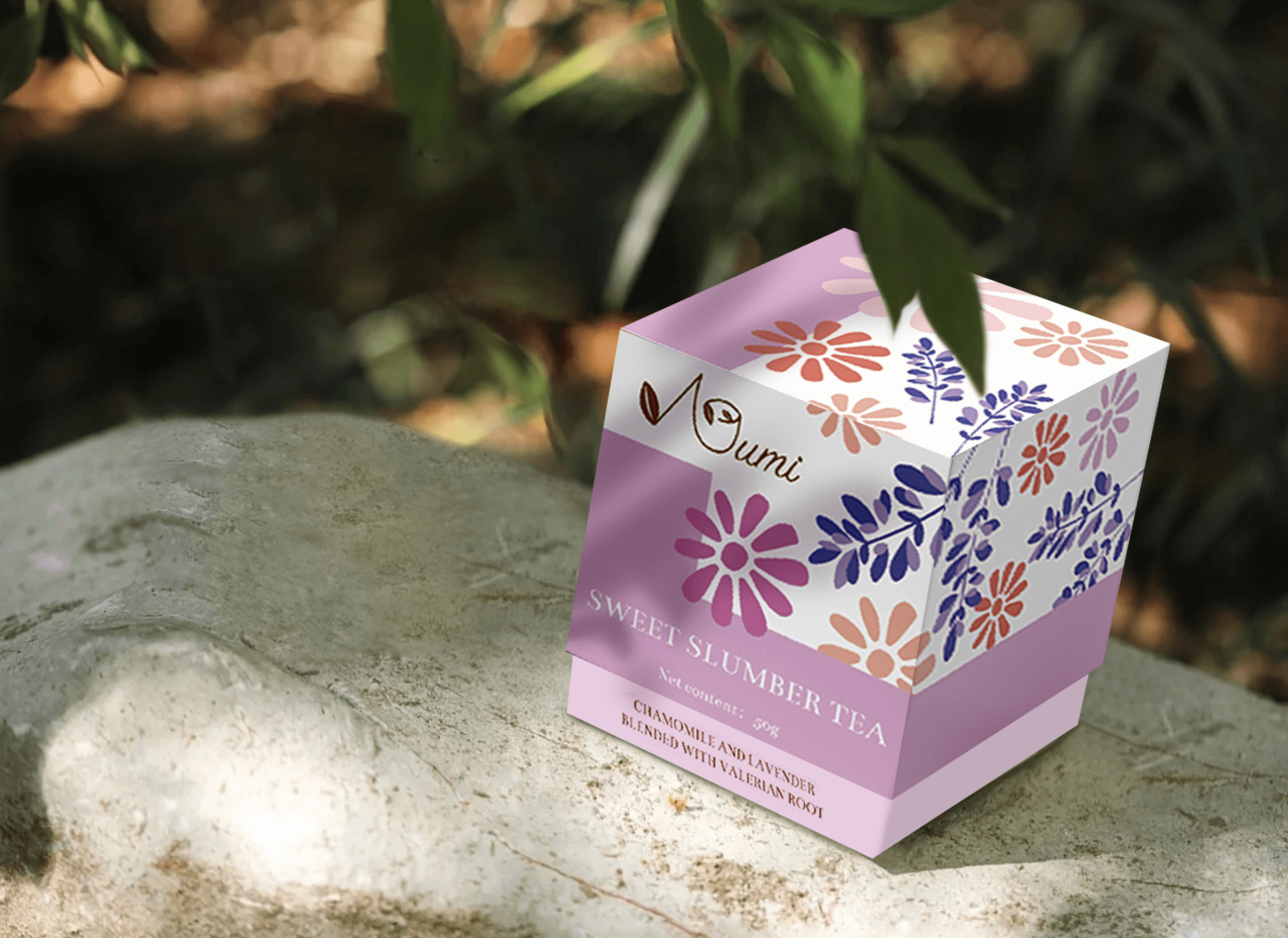
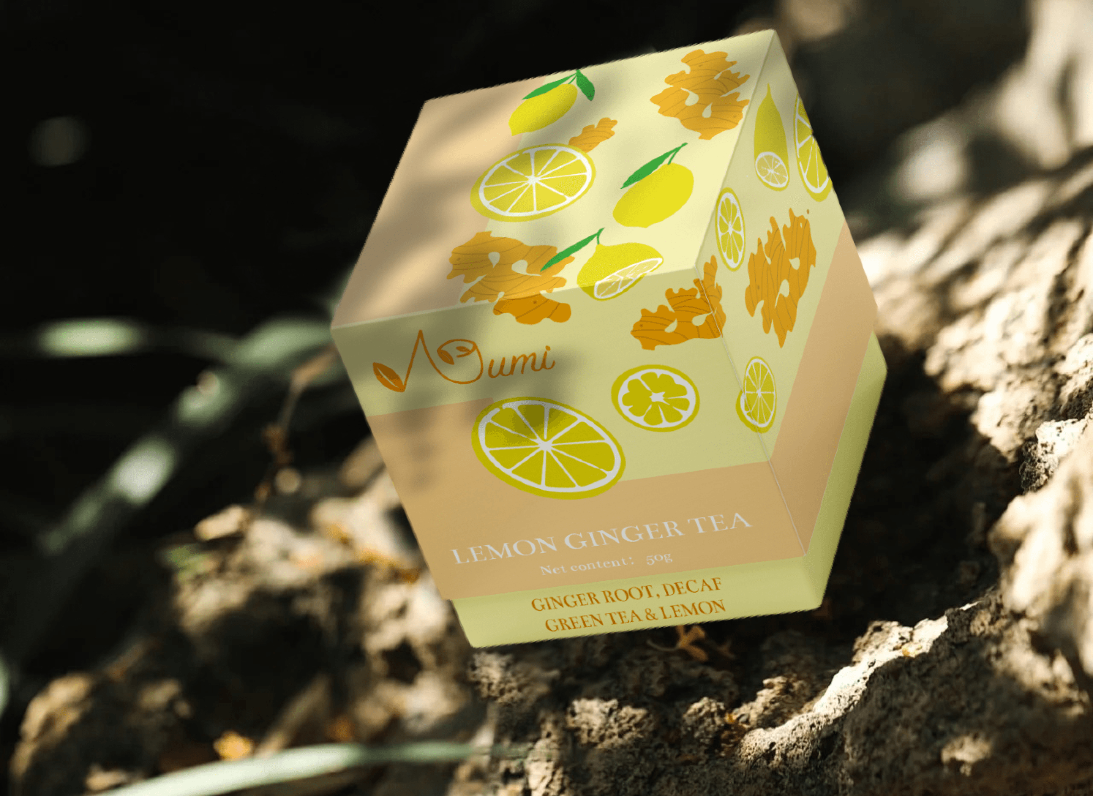
PACKAGE DESIGN
A Bold Step to Stand Out
The redesigned packaging for Numi Tea aims to stand out in the market with its innovative and cohesive design. I not only focused on the exterior of the box but also carefully designed the interior, ensuring consumers enjoy a unified visual experience. To differentiate the brand, I chose bright and vibrant colors as the primary palette—something rarely seen in the market—and incorporated trendy flat-style illustrations. These design choices elevate the packaging, making it more premium and visually appealing, while also aligning with modern aesthetics and consumer preferences.
LEARNING
Gained expertise in designing a cohesive brand system and understanding its operational processes.
REFLECTION
In this project, I successfully designed a cohesive brand system, integrating elements like logos, packaging, and visual patterns to ensure consistency and alignment with the brand’s identity. I also gained valuable insights into the operational processes behind brand development, which will enable me to adapt to new projects and workflows more quickly in the future. This experience enhanced my ability to think systematically about design and strengthened my strategic approach to building brands.
Learning to Build a Comprehensive Brand System